Northview
High School
High School
Where Spirit Meets Strength
Branding,
Visual Identity,
Logo Creation
Visual Identity,
Logo Creation
2025
Intro
Northview High School, home of the Titans, is a public school in northeast Fulton County offering a rigorous academic program alongside extensive arts, technology, and athletics. With over eighty clubs and organizations, Northview fosters excellence and pride across a diverse student body.
As the school has grown, its identity lacked cohesion, relying on a fragmented “N” mark without brand standards and missing a visual representation of its Titan mascot. To unify its spirit and presence, Northview needed a refreshed identity system that honored its tradition while giving its community a bold and consistent voice.
Before
after
Northview High School’s identity relied primarily on a standalone “N” mark that lacked consistency and clarity. The logo had been used in varying forms without defined standards, leading to visual fragmentation across uniforms, signage, and communications.
The process began with research into the school’s story and the Titan, Atlas, who represents strength and resilience. I started sketching explorations of Titans, experimenting with different forms of power, motion, and symbolism. At the same time, I studied the existing “N” mark to see how it could be modernized without losing recognition. Without a mascot logo or brand guidelines, Northview’s identity felt incomplete and missed the opportunity to unite its community with a strong, recognizable brand.
From hand-drawn sketches,
I refined a bold, athletic Titan
logo that could function across print, digital, and merchandise.
The design needed to feel powerful and timeless, while staying versatile for a range of school uses.
I refined a bold, athletic Titan
logo that could function across print, digital, and merchandise.
The design needed to feel powerful and timeless, while staying versatile for a range of school uses.
“Atlas” is a bold, contemporary evolution
of Northview High School’s mascot,
designed to re-energize Northview’s brand and embody Titan pride with a clean, stylized silhouette. His form reflects the school’s legacy while also creating a consistent and ownable visual asset. His design system pulls directly from Northview’s core identity, integrating the lightning bolt and “N” mark into key features like the helmet, plume, and chest medallion.
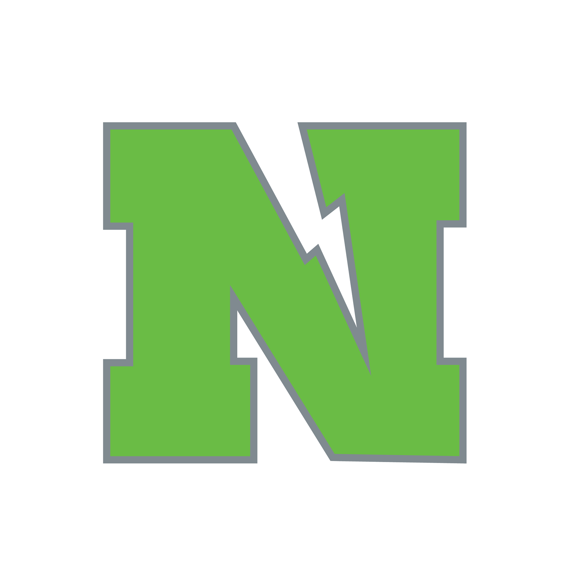
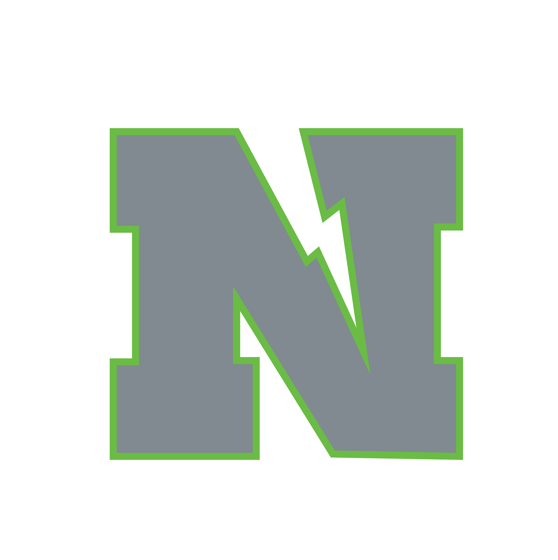
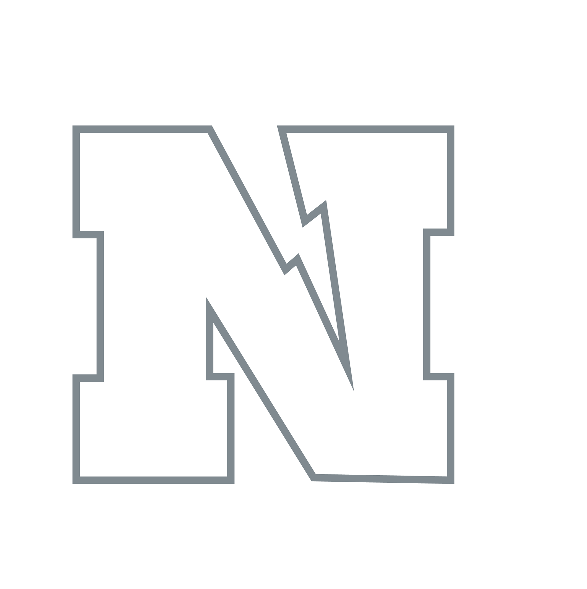
I also re-engineered the “N” logo, introducing a lightning bolt as negative space, giving it a refreshed, dynamic energy while keeping it instantly recognizable.



To unify the school’s identity, I developed
a full set of brand guidelines.
a full set of brand guidelines.
A refreshed color palette rooted in Northview’s heritage, optimized for print and digital.
Typography standards for consistency in communication.
Usage guidelines for the Titan and “N” logos to ensure clarity and impact across applications.
Northview High School now has a complete, professional identity system. For the first time, the Titan mascot has a visual presence, and the refined “N” creates a stronger, more energetic symbol for the school. Together, the logos and guidelines form a cohesive brand that inspires pride and strengthens school spirit.